 Case Study
How I Helped an Industry Leader Redesign Their Event Software SaaS and Reach More Audience
-
Position
Principal Product Designer
-
Expertise
Design, Interaction, Branding, Front-end, Planning, Research
-
Platform
Web, iOS, Android, Print
-
Interested?
Position
Principal Product Designer
Expertise
Design, Interaction, Branding, Front-end, Planning, Research
Platform
Web, iOS, Android, Print
Interested?
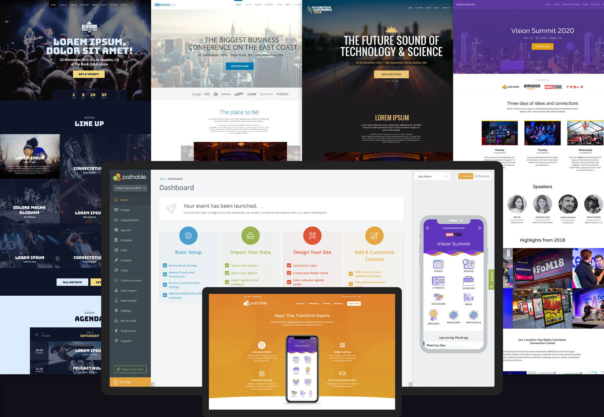
Pathable Is One of the Leading Providers of Event Apps for Trade Shows, Events and Associations
It is a robust event platform/CMS able to produce powerful mobile event apps and conference microsites. Trusted by companies like Amazon, Microsoft, SAP, Socap, Yahoo, NBA All Stars, O’Reilly and many more to provide an all-inclusive app for their events. Heading the entire suite redesign and establishing lasting design processes and practices to ensure team growth was both exciting and challenging, but above all a big responsibility.
I joined Pathable in early 2016 as a principal product designer, part of a completely remote team that counted 20+ employees across the entire globe. The goal was to rethink, redesign and innovate their existing product, and offer their loyal clients an improved design experience.
Identifying the Pain Points Is Where a Good UX Journey Begins
An extensive UX research process began which was supposed to evaluate the existing app, see where it performed well and where it fell short, and identify its position amongst the competition. The results we got provided a lot of insights and gave us a good starting point. The team began creating charts and personas based on real clients, mockup new workflows and wireframes, develop prototypes and templates, and what's most important thought of possible ways to innovate and set the product apart from the competition.
Unique Challenges and Overcoming Them With Good Preparation
It was not easy to balance the new approach – to what extent to stray from the existing app without confusing the existing client base that was used to the old system and had very specific requirements. Even though it was tempting to work on a sleek and experimental UI, our past data, interviews and user feedback revealed that we need to build for simplicity, consistency and structure, but most of all, design for big data.
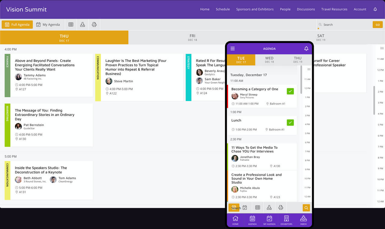
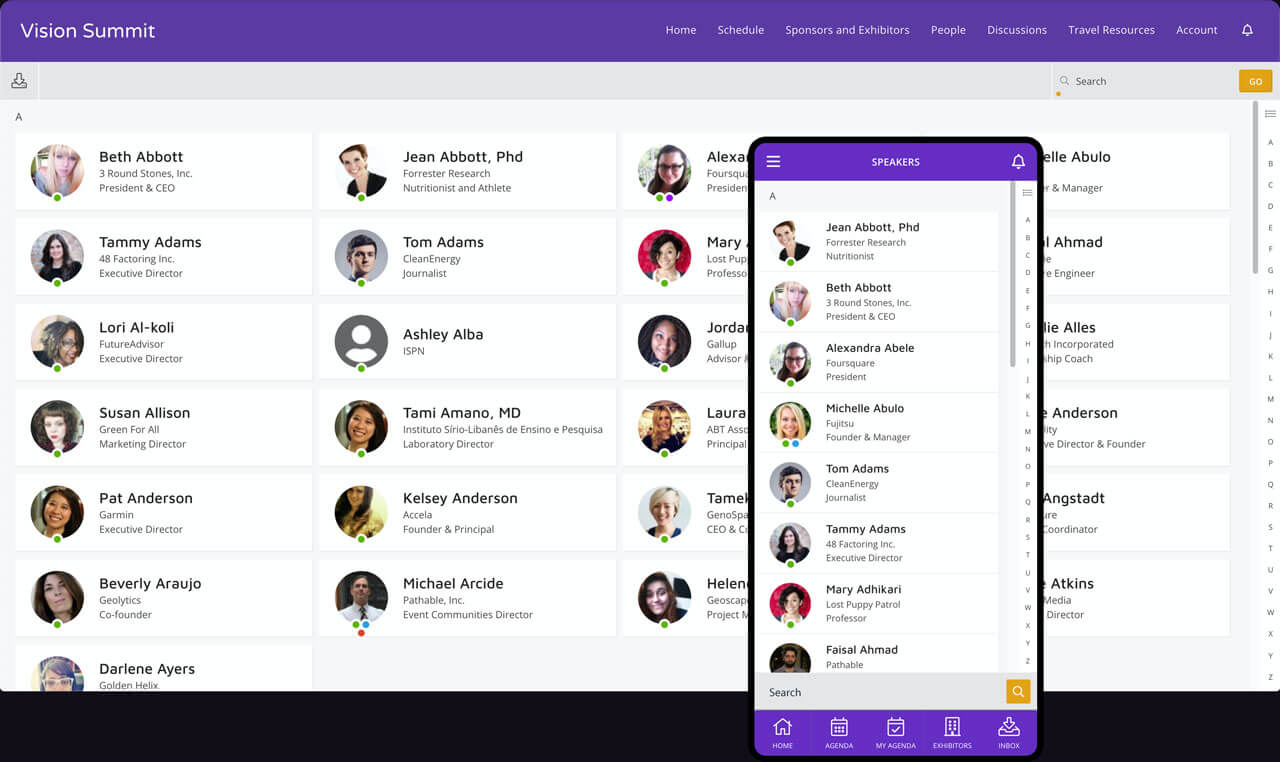
We needed to display big and complex event agendas, 1000s of different types of attendees, exhibitors and sponsors, show maps, resources, polls, provide matchmaking, messaging, email campaigns, gamification, public forums, all packaged as a native mobile app for Android and iOS. Two categories of users were included in the design – our clients that buy the CMS to build event apps, and then their attendees who ultimately use the app.
Expectations were high. It was important for the system to be easy to navigate, consistent, use familiar UI patterns and provide enough headstart to make our users feel like the app is actually helping them, instead of being another chore. We were practicing CX, so our users were always in the focus by doing surveys, interviews and AB testing sessions.
Think Ahead and Innovate
Few new ideas did find an important place in the new system, the biggest ones being the theme/template system and the widget library. Others were things like gamification, new attendee message boards, email templates, matchmaking, etc.
Build Anything You Need With a Powerful Widget System
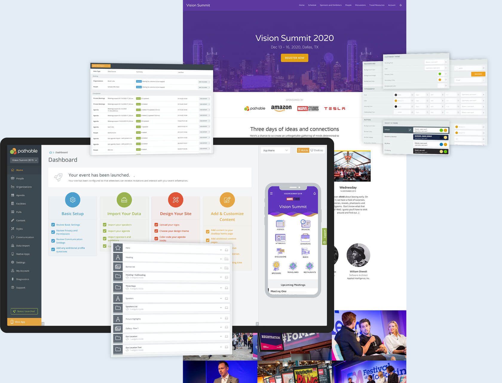
The widget library was the core of the attendee facing app and providing content blocks easy to use to create and edit any page. Do you need to add a chunk of text on a page? No problem at all, as all you need to do is drag the text widget, add text and get it on the page, automatically styled according to the theme and user style settings.
Themes and Style Settings for Easy Branding
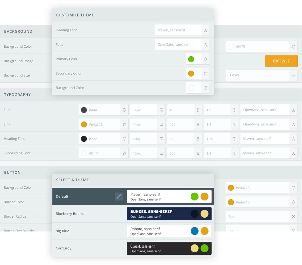
The theme/template system allows users to not only build event apps, but also promote websites and landing pages. It was the most requested feature by our users, because as an event organizer you could manage your web presence in a single place. They no longer had to create websites using WordPress or another CMS/sitebuilder, now it was possible to do everything together with the app itself. This was also supposed to be a competitive edge, as none of the other event app providers offered this.
How You Build a High Performing Ui and Provide a Great Experience
It all begins with a well planned design sprint, as it guarantees delivery of quality features on a constant basis. When it comes to building complex apps, proper pacing means a lot, because it’s a an extensive process that goes on for years. Also, it’s additionally challenging when the design sprint goes in parallel with the development sprint. Achieving alignment between the two is a key to productivity and outstanding results.
My knowledge in HTML, SCSS and basic Javascript helped me bridge the gap between design and development, because I could work directly with the developers on creating the React components. This was very important because we had an entire style settings system that was completely customizable, and my knowledge of core CSS was pivotal in developing a CSS replica in Javascript that we could update in real time.
After building the core of the app, a big part of our feature cycle was testing. We conducted a few types: first, an internal testing with our QA and sales teams, then, after things were polished, we did testing with a group of our existing clients, and finally, testing on-site during real conferences and events.
Design System That Can Be Customized by Anyone
This brought the biggest technical challenge for me so far - I was supposed to create a completely flexible style system that would support React components and allow our users to be able to change a big part of it using the Style Settings forms in the admin UI. What this meant was a very complicated style structure dependent on variables, using CSS written in JS, a.k.a. JSS.
These style settings were supposed to allow users to completely customize the designs on a few levels, from simple one-click theme selection, to complex CSS customizations in order to achieve something specific.
After we got into our groove of shipping feature after feature, things became more straightforward and running design sprints got much easier. My team was small and agile, so we were able to achieve a lot while doing regular user testing. The feedback we received was invaluable.
Logo & Branding Refresh
As part of the entire app redesign we decided the time was right to also refresh the logo and work on the brand identity. The original idea behind was built upon connecting different audiences in a single place, helping them establish and build lasting business relationships.
 Old Logo
Streamlined Native Mobile Experience for iOS and Android
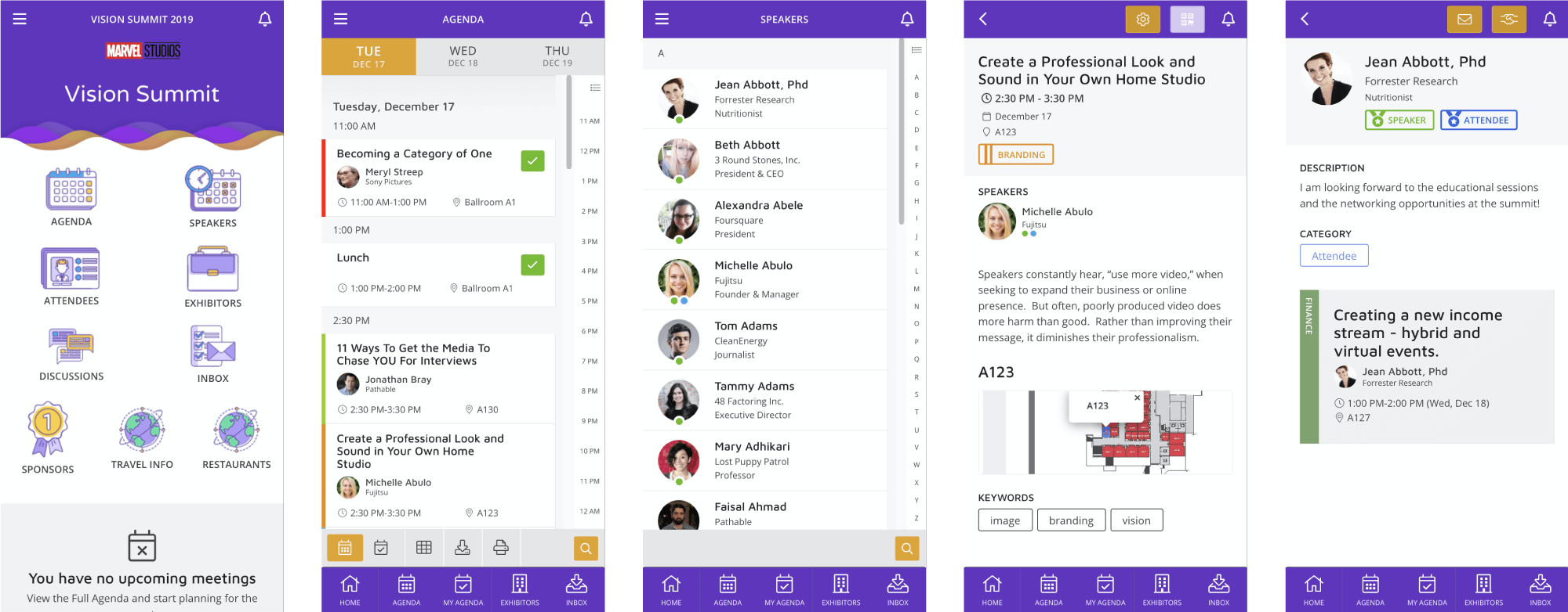
At the end of the day, the goal was to create an event app that would help attendees get the most out of an event and connect with other people with shared interests. We are supposed to make the event as good as possible for all the attendees participating, let them easily navigate and find out about all that it's offered and connect with other like minded people. Just install the app and there's nothing else to worry about.
Always Go for a Positive Impact
The results we started getting, even in our alpha stage, were very exciting. Sure, there were bumps along the way and some technical difficulties, but it was a new product and we knew we were going forward. When we entered beta, things started to really pick up. More and more clients were moved from the old platform to the new, so we had more user input and participation in mapping out improvements and future features.
The support team benefited as well, as the onboarding process got a lot easier with powerful automation for both our clients and the team.
Our sales team got great feedback from the demos, providing another great source of information for the design and development teams. This also helped the sales and marketing teams with their presentations, resulting in increased number of successful demos and closed sales.
Ultimately, the adoption rate and use of our event apps on-site was significantly increased because of the new onboarding process and integrations, effective and customizable agenda, smart matchmaking, easy access to documents & maps and various options for chat and interaction.